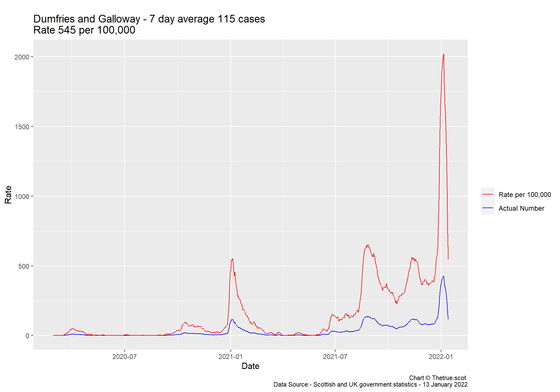
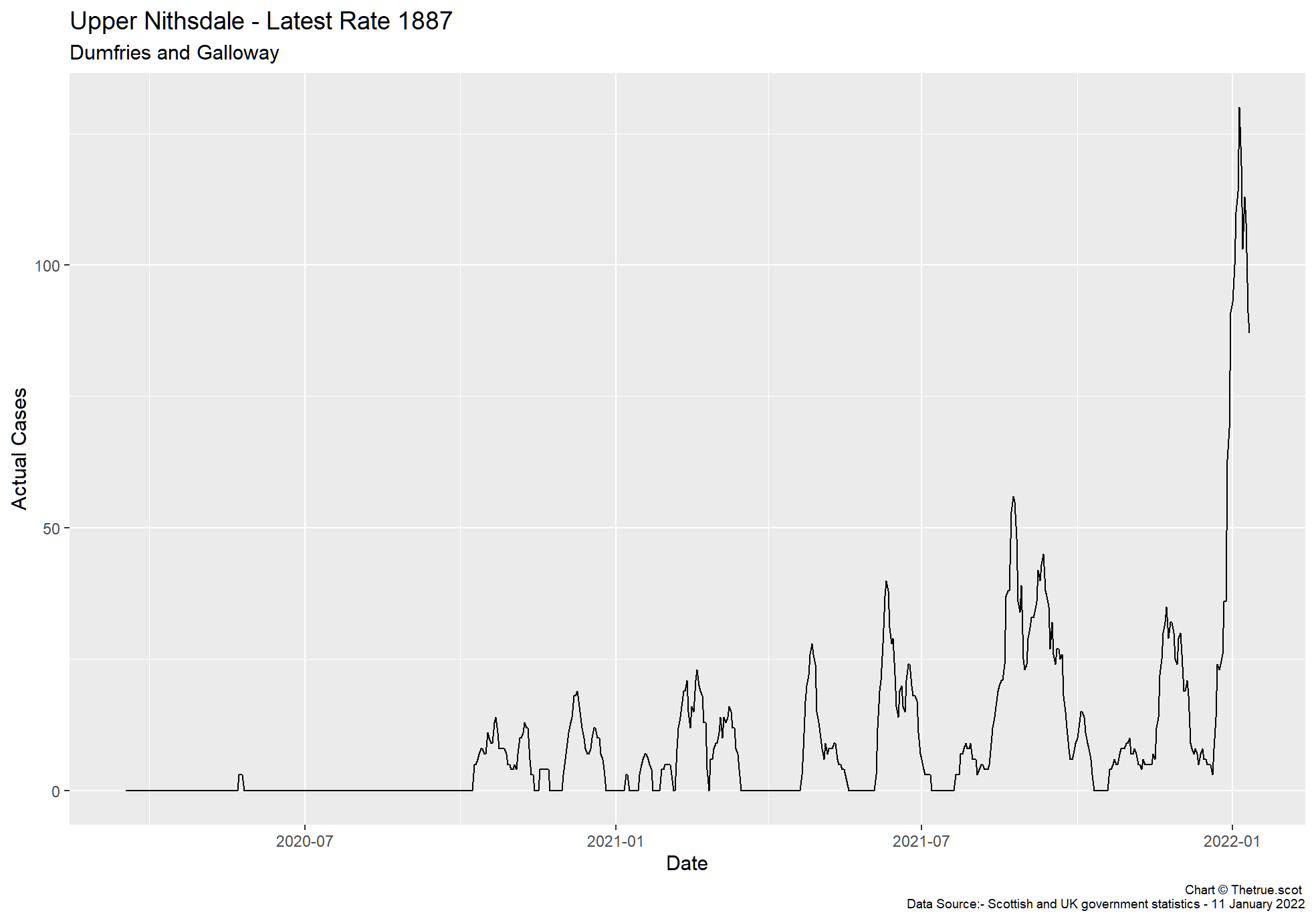
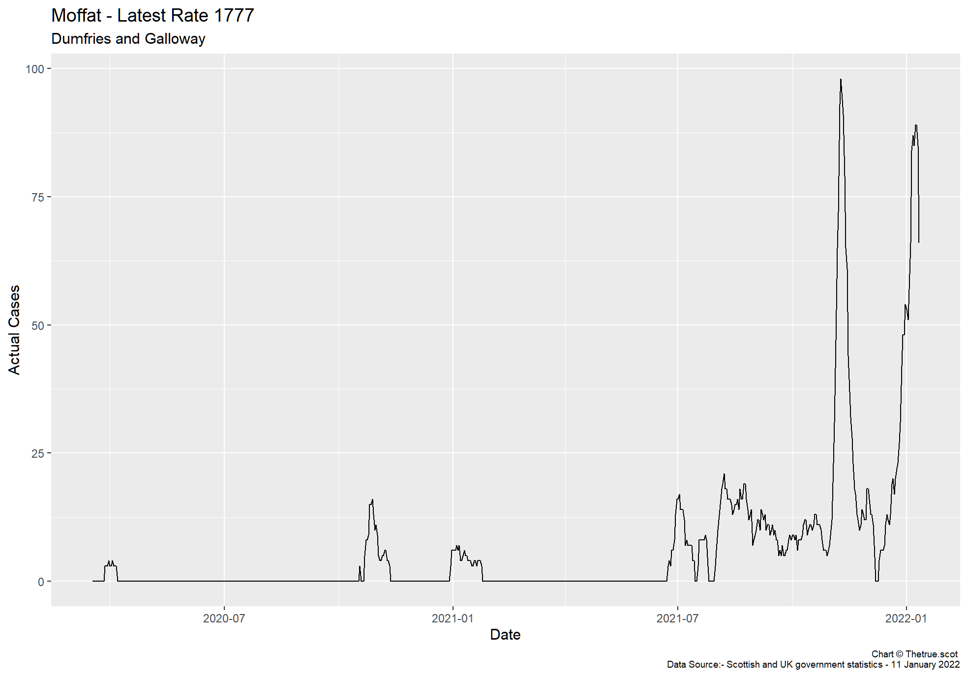
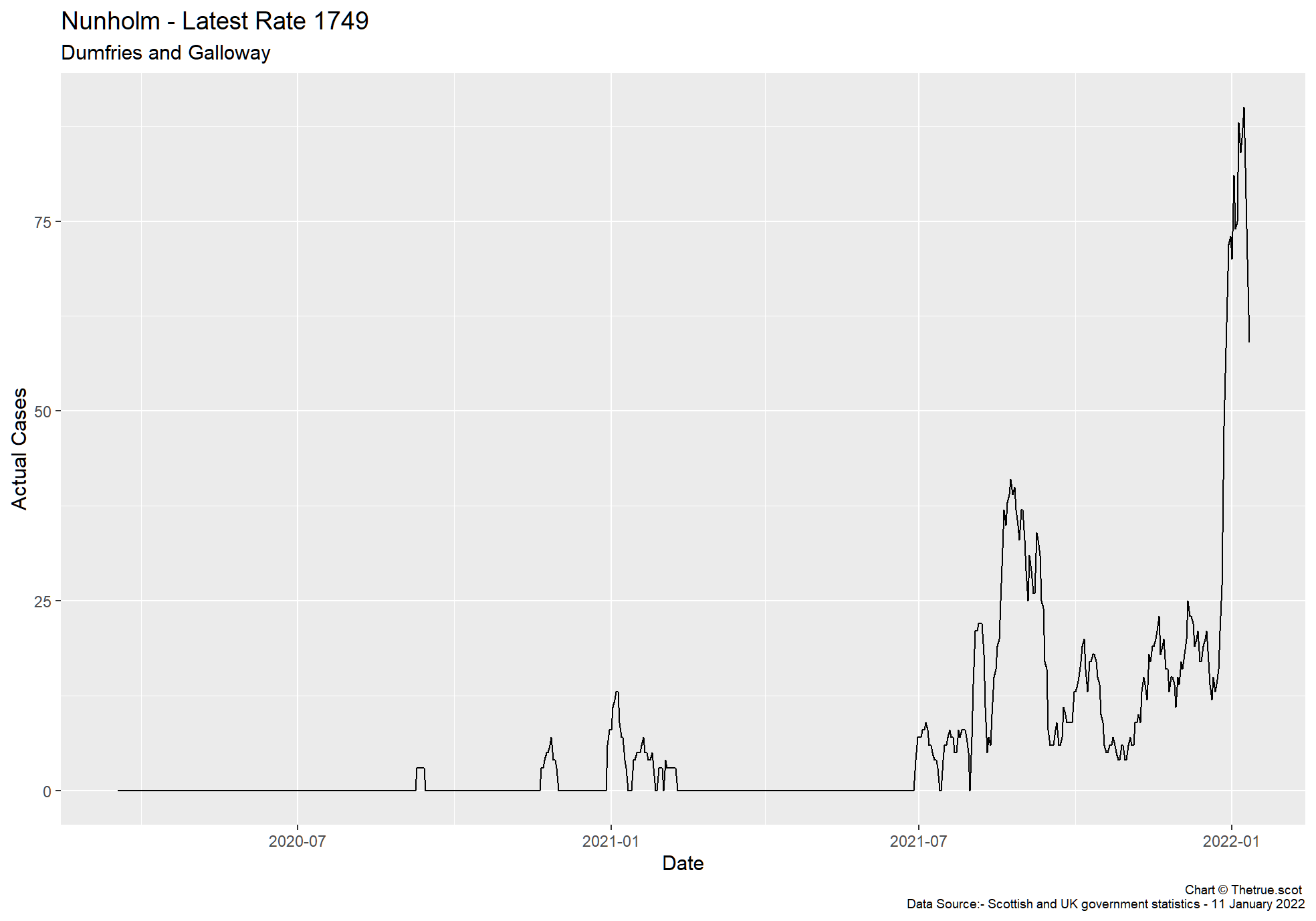
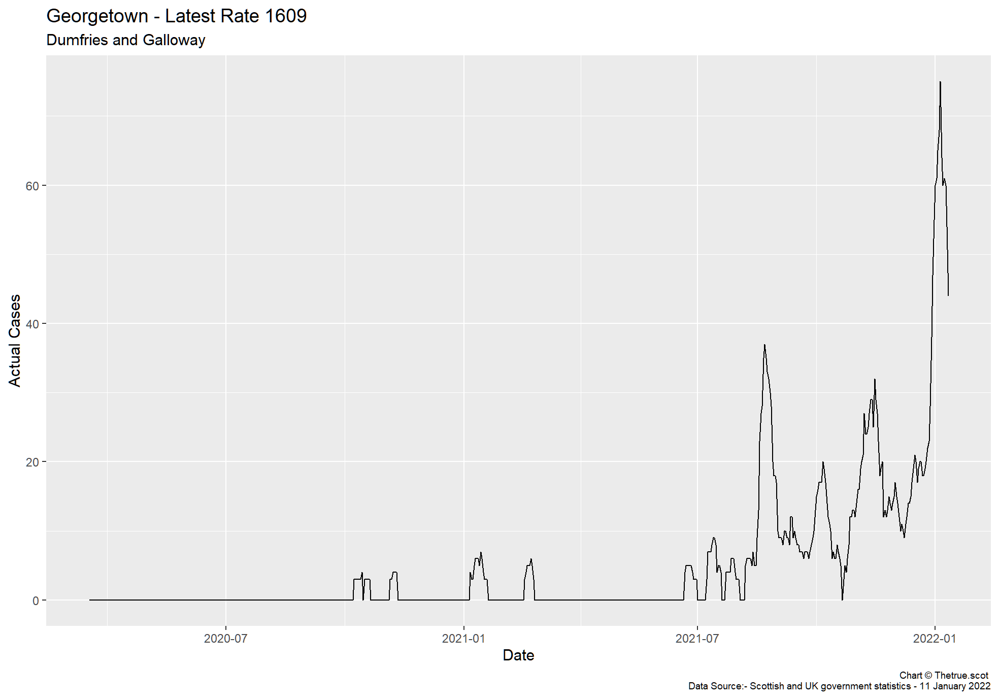
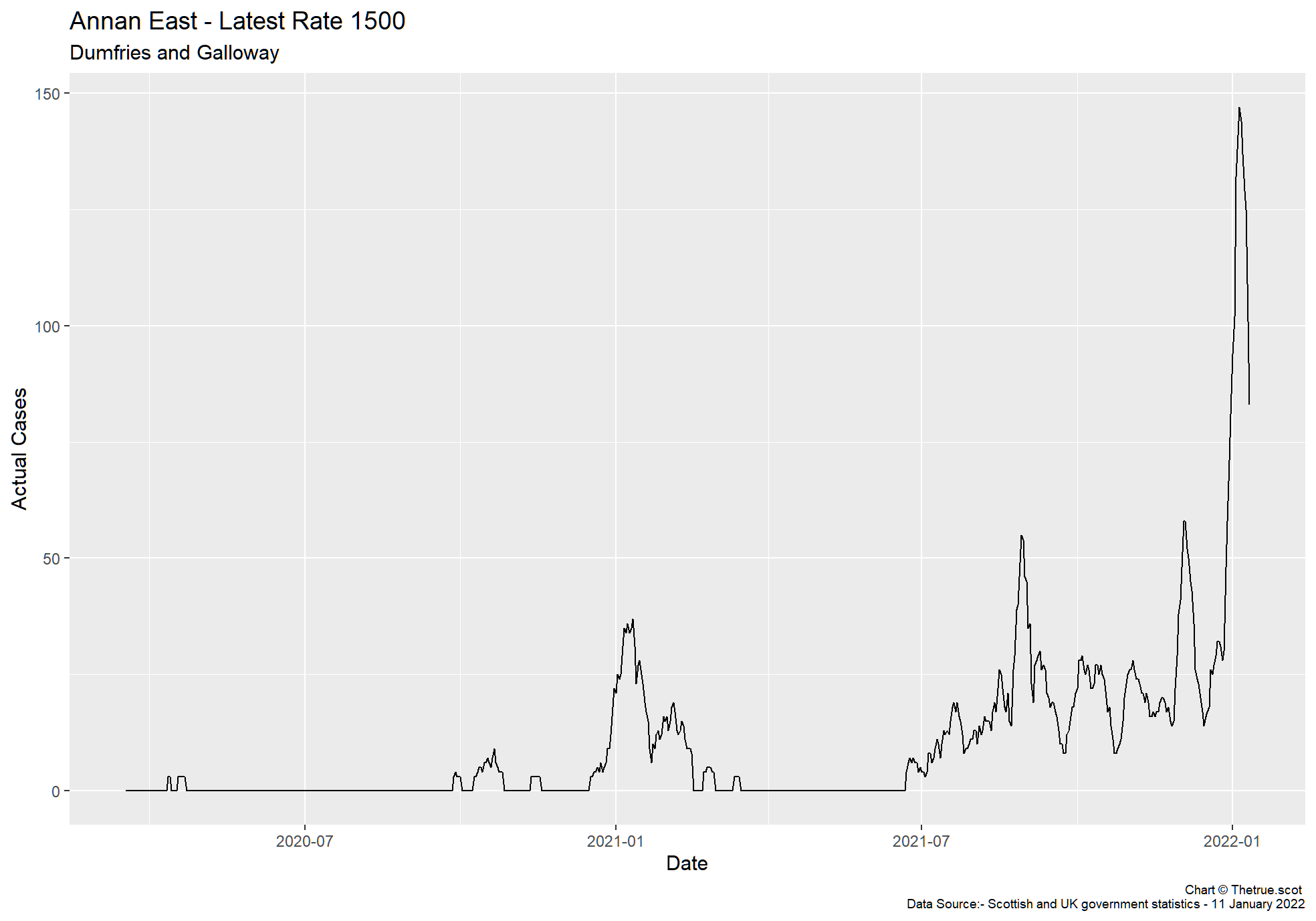
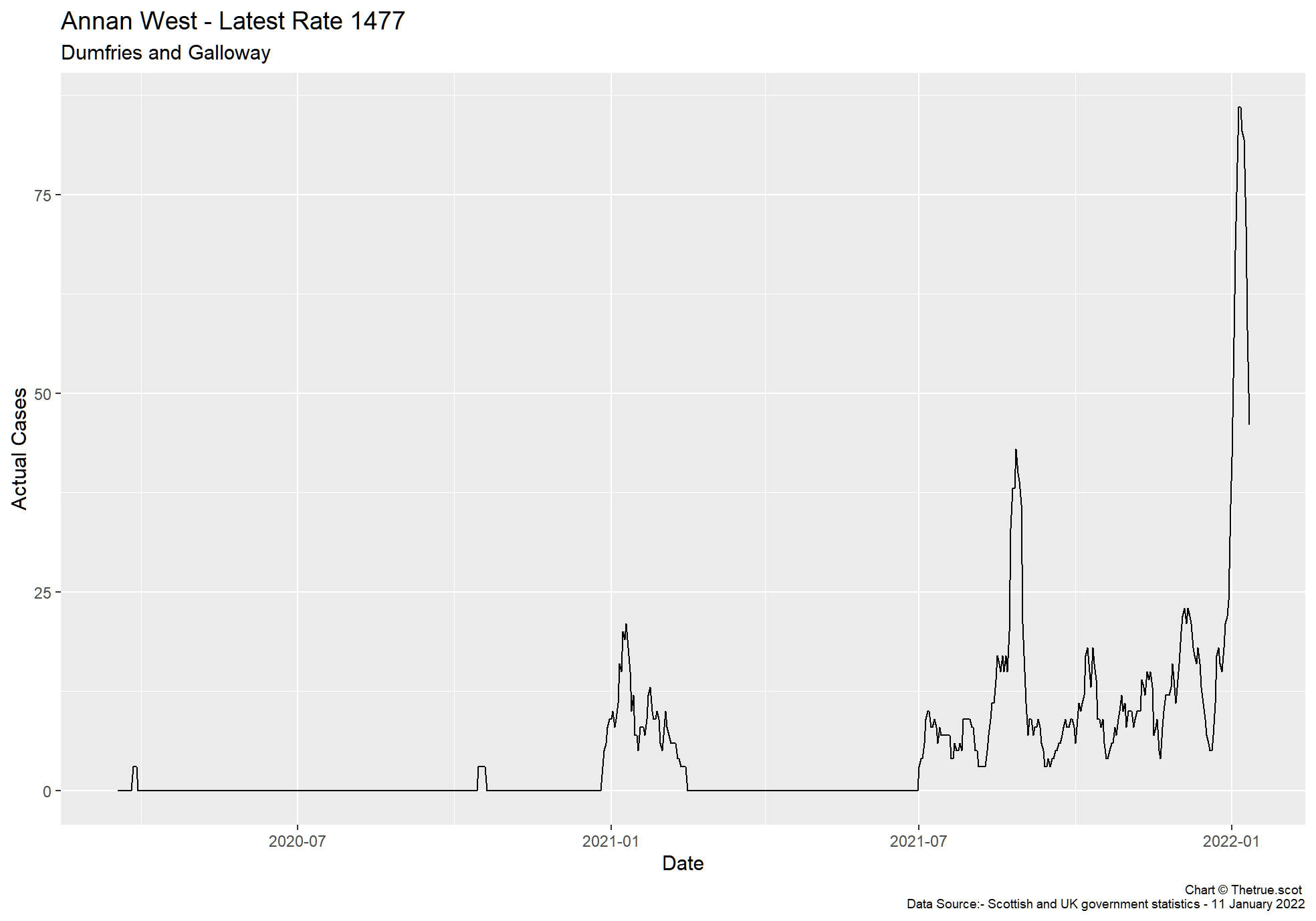
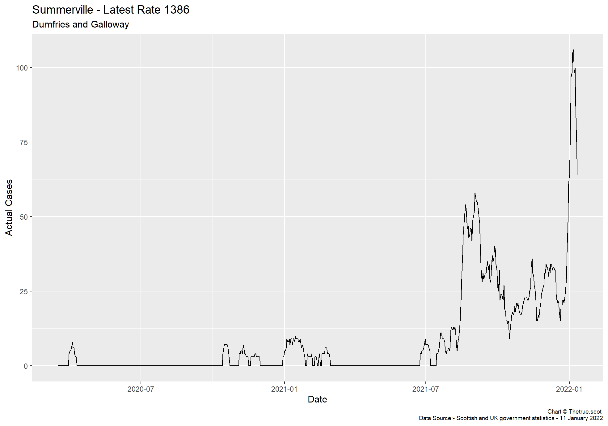
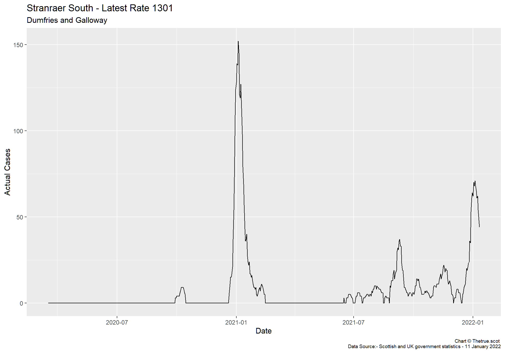
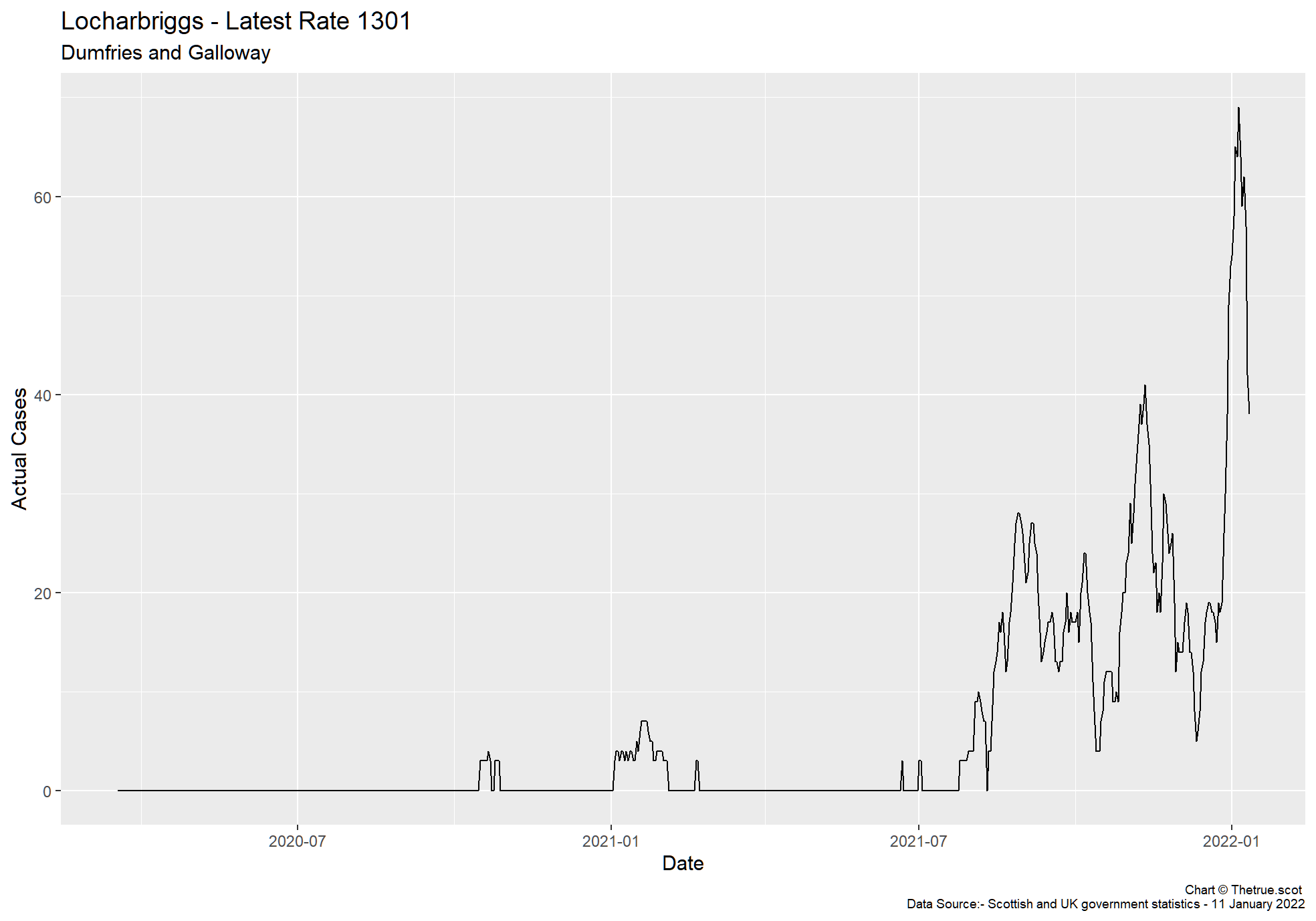
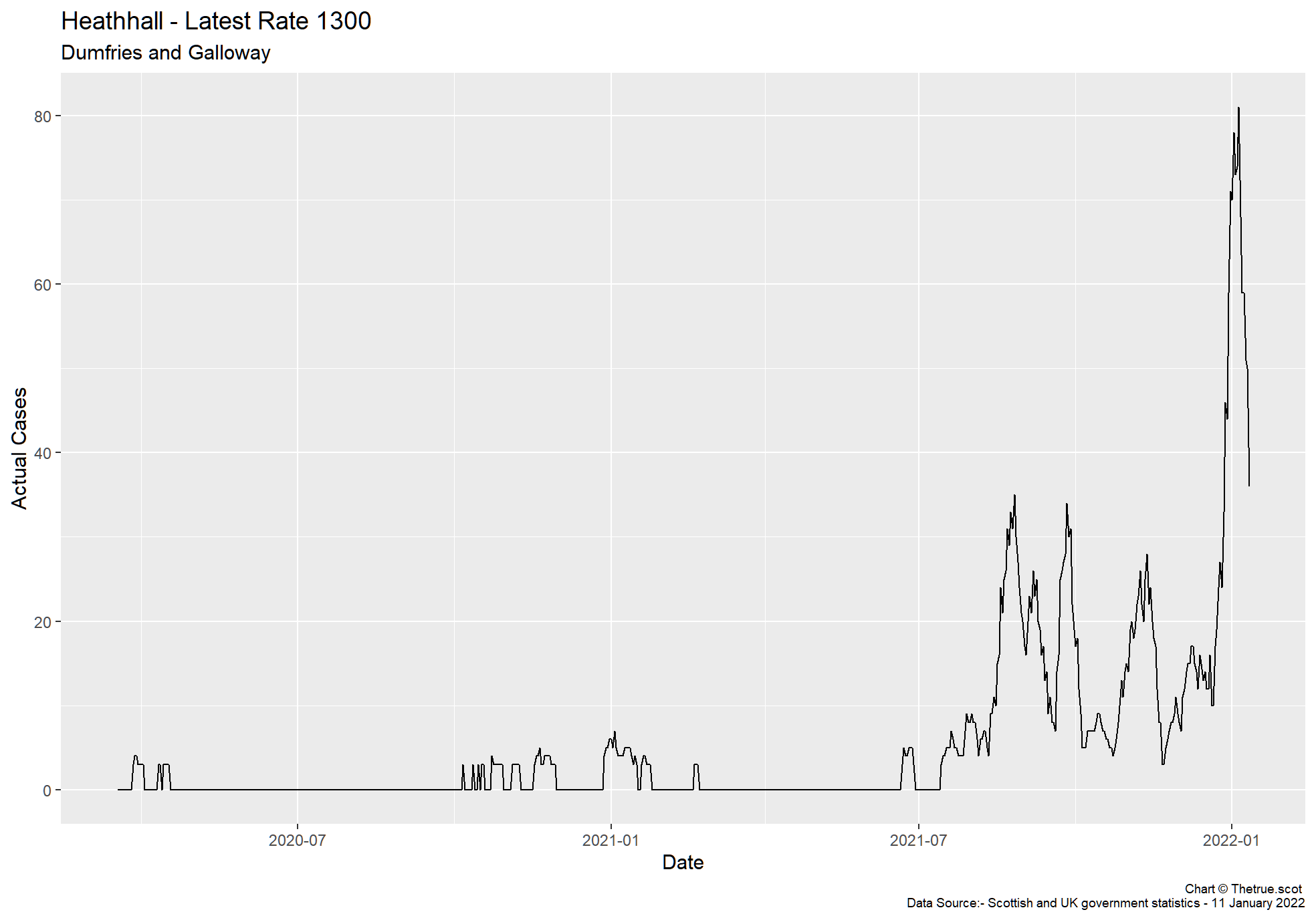
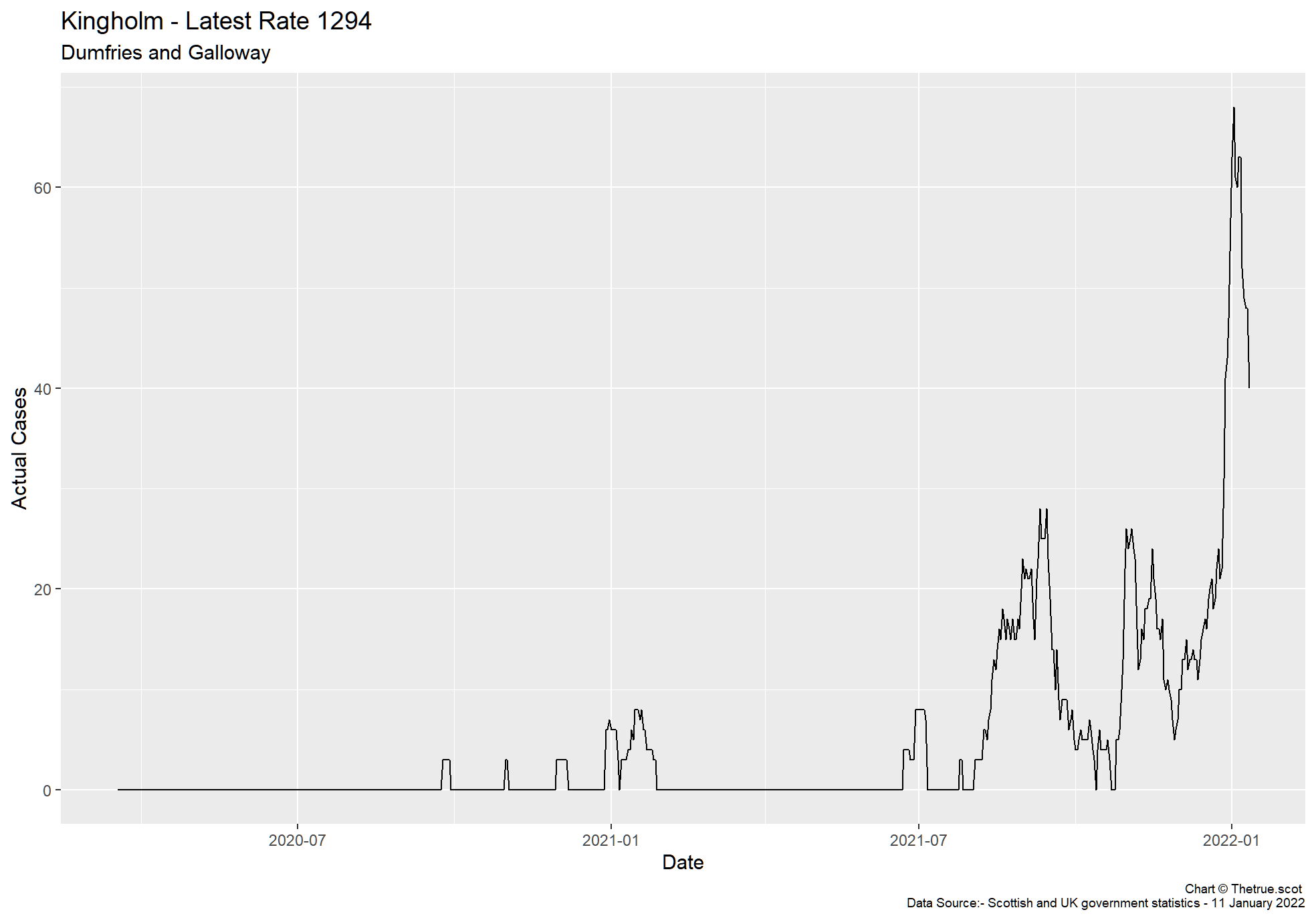
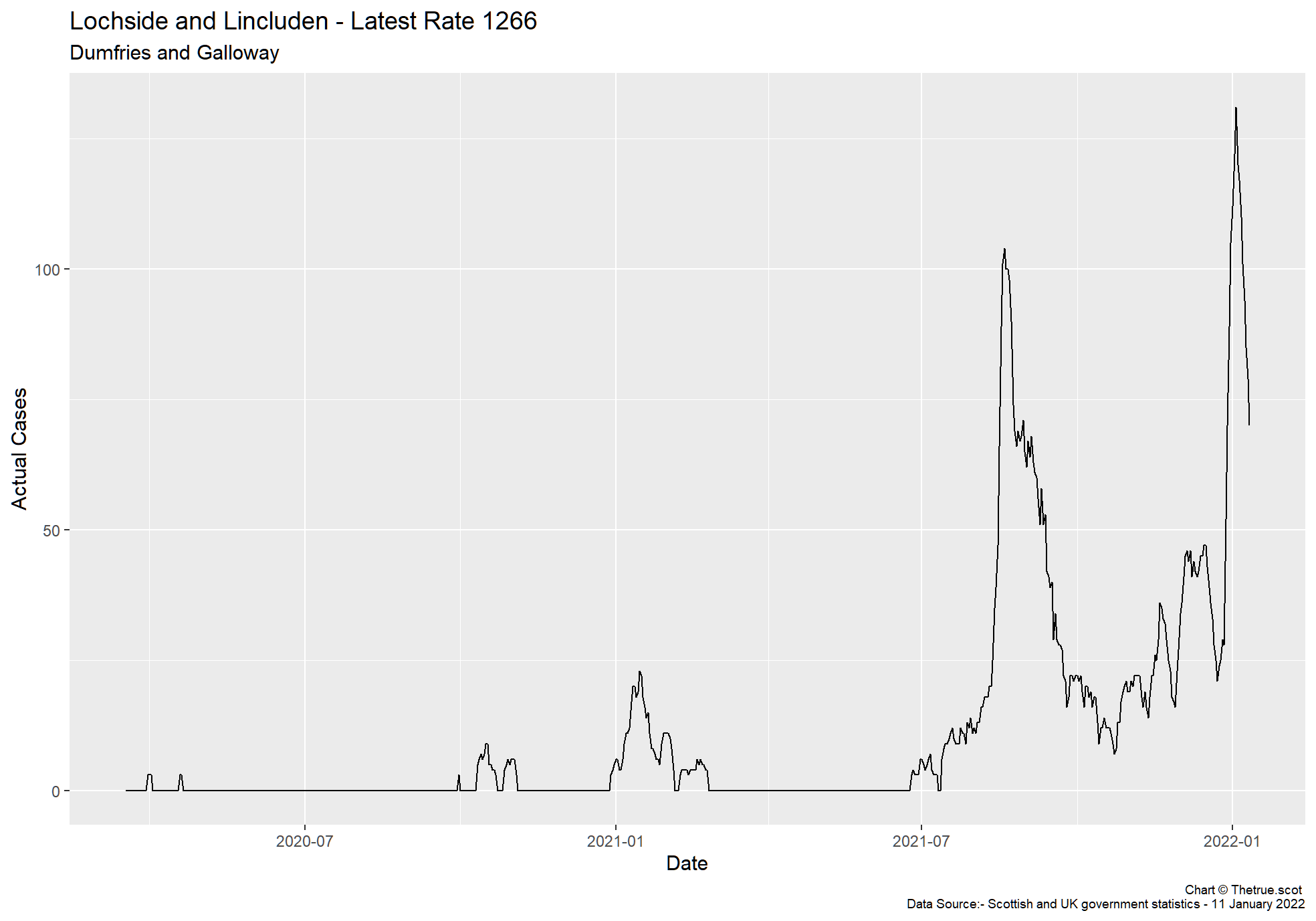
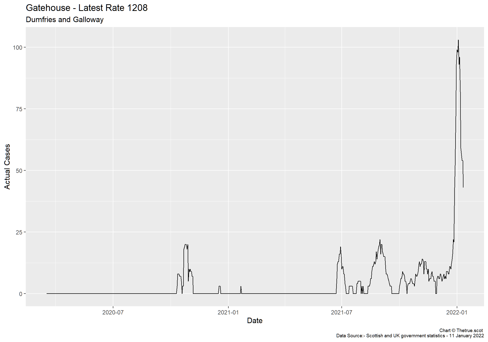
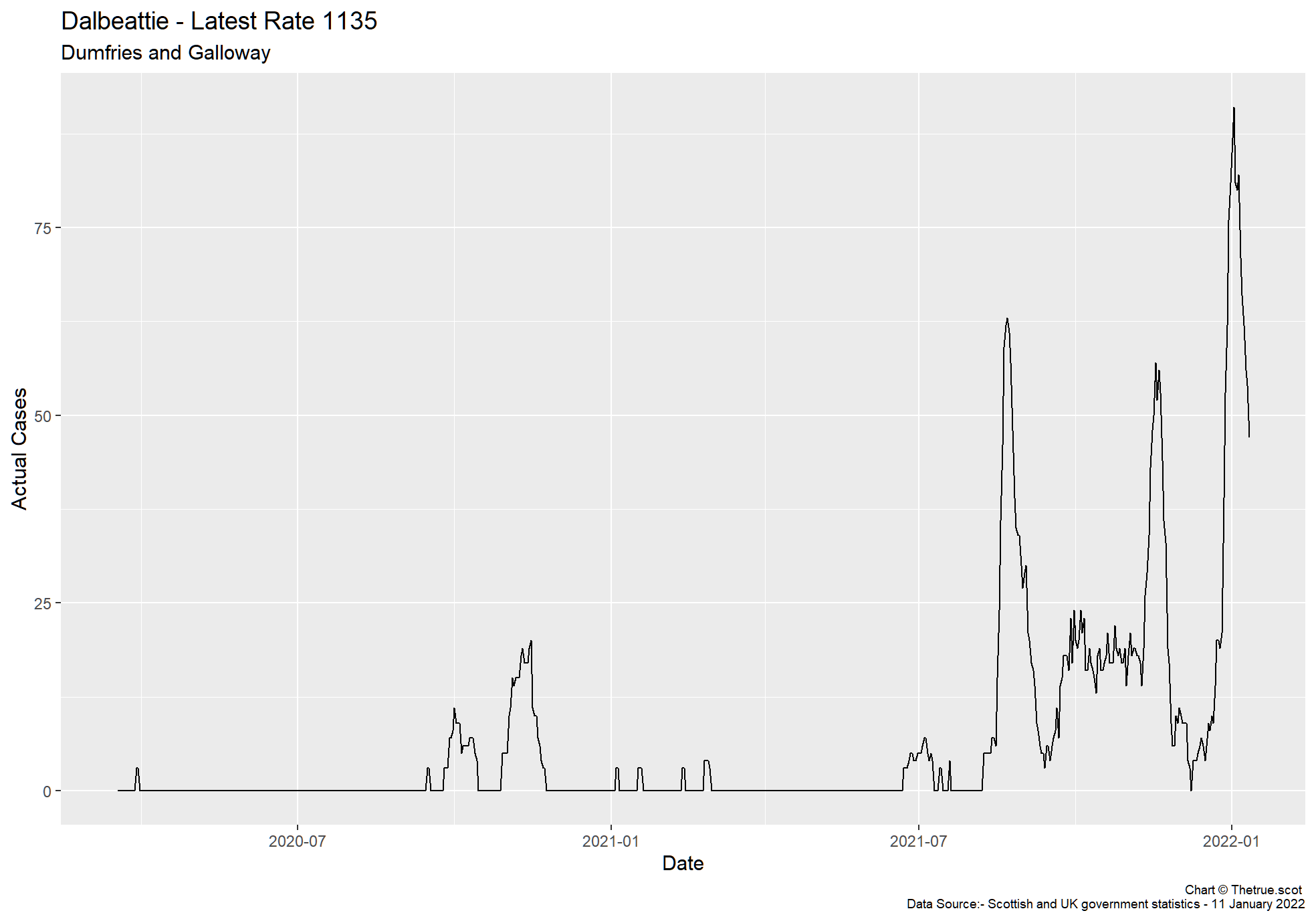
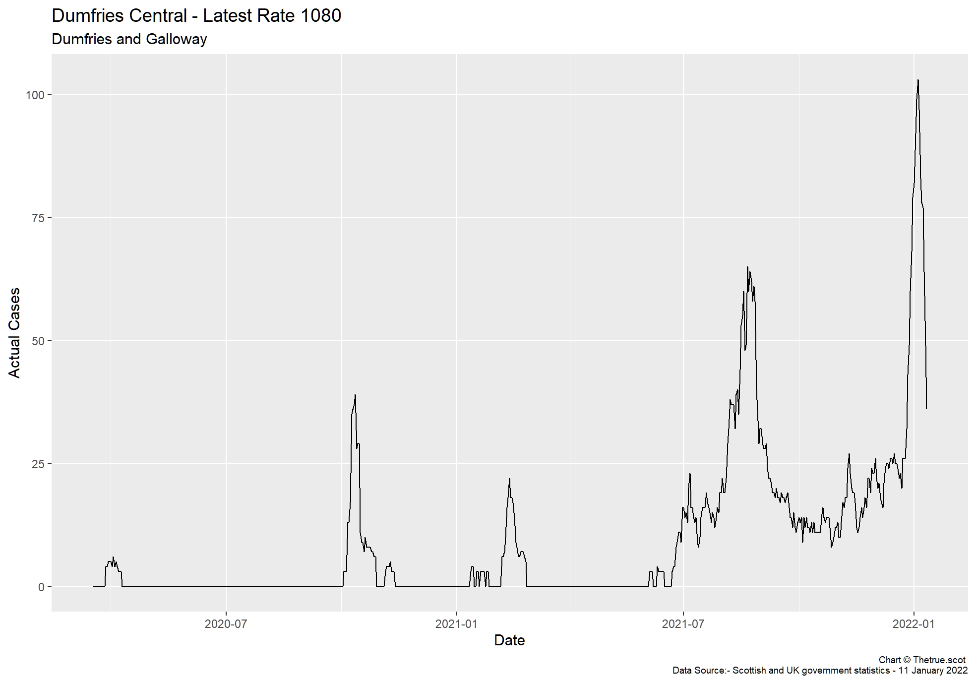
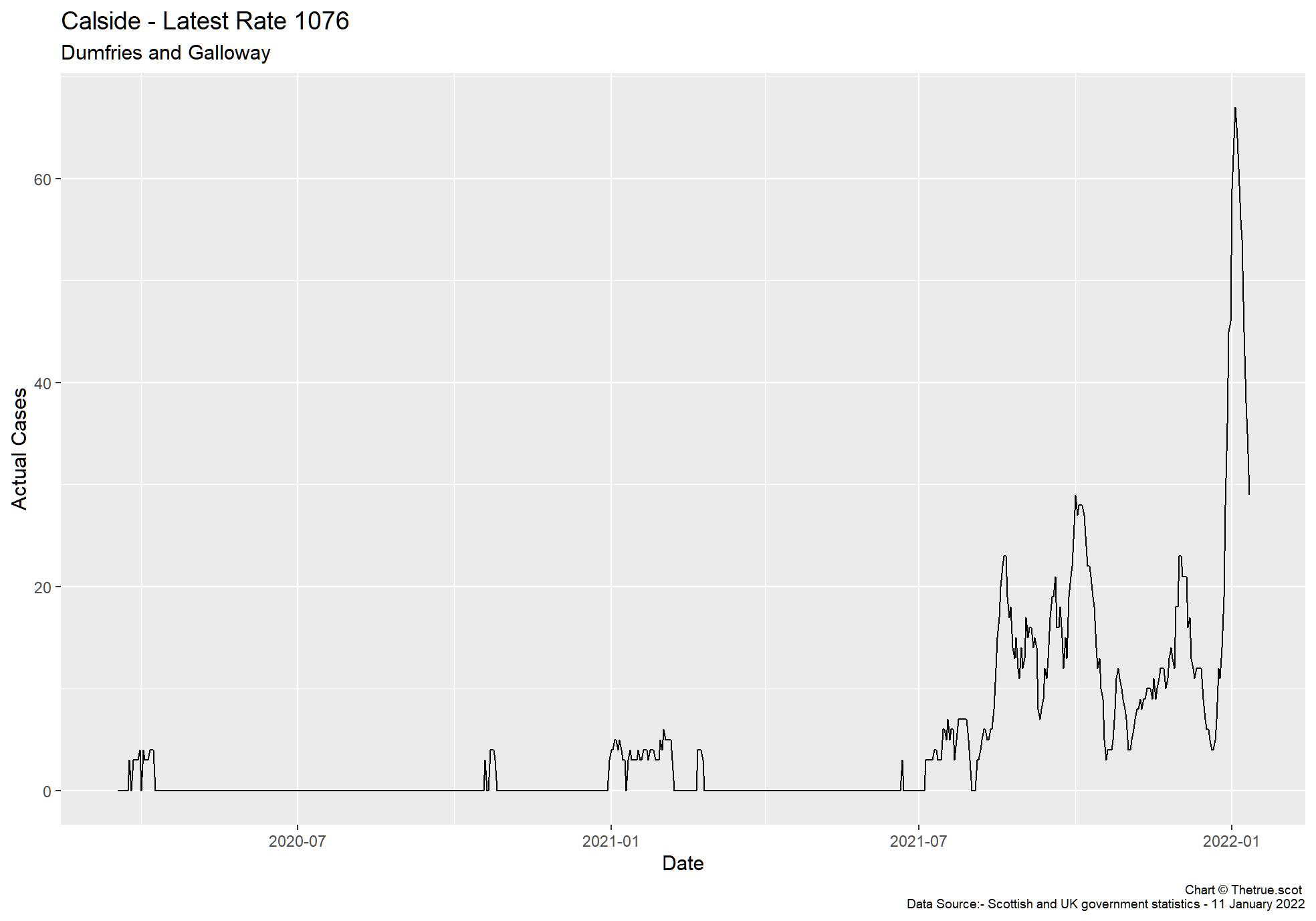
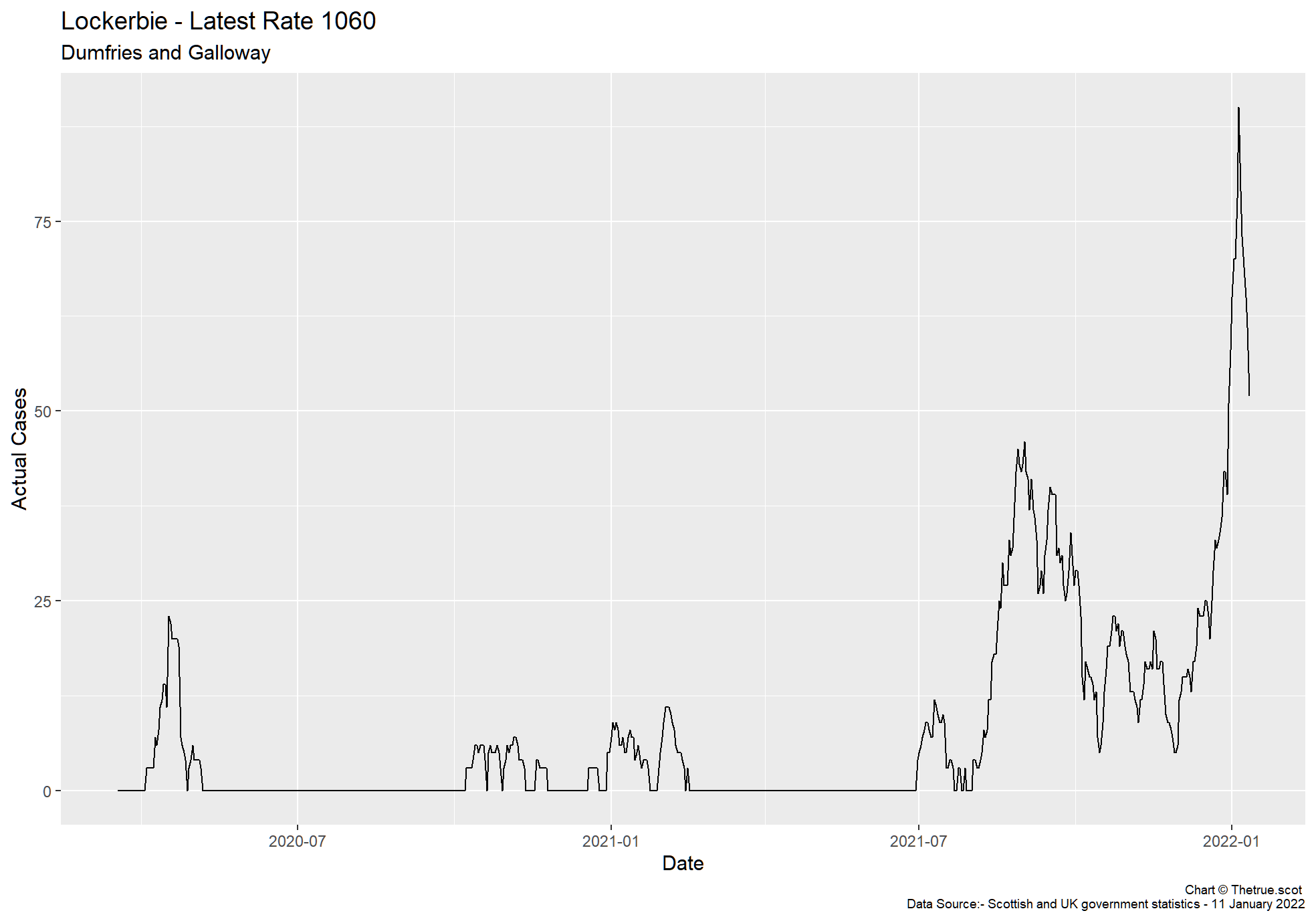
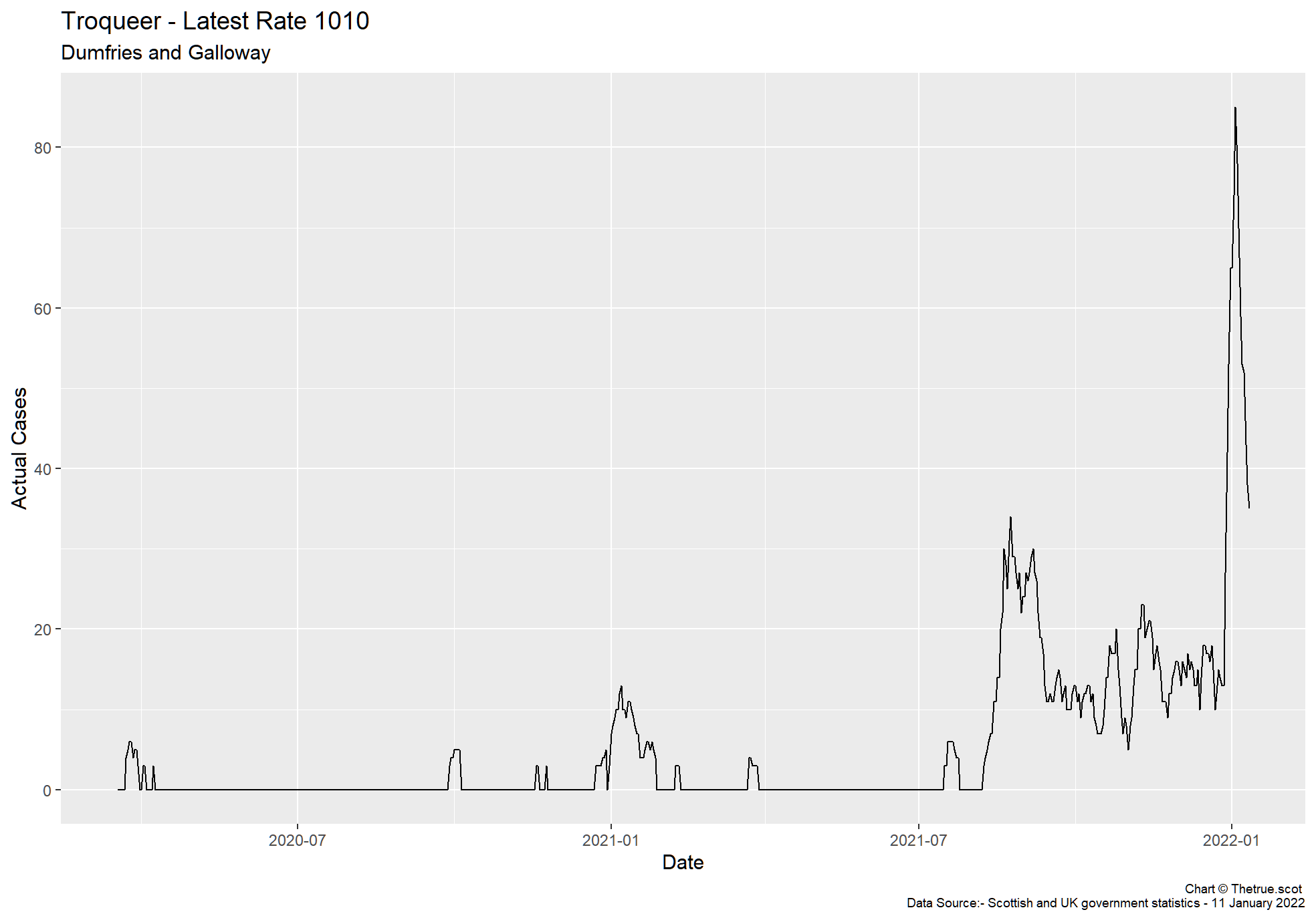
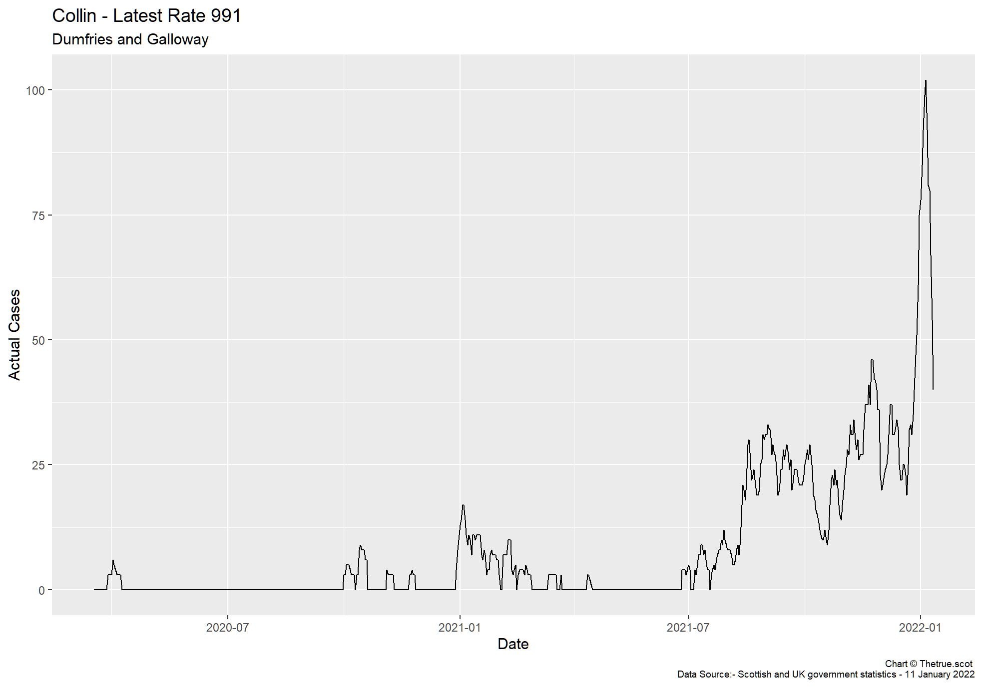
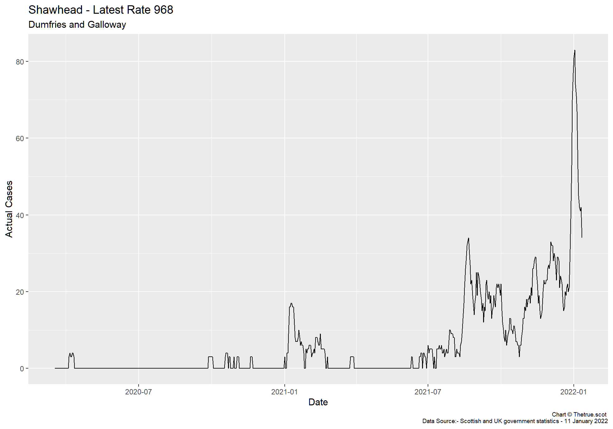
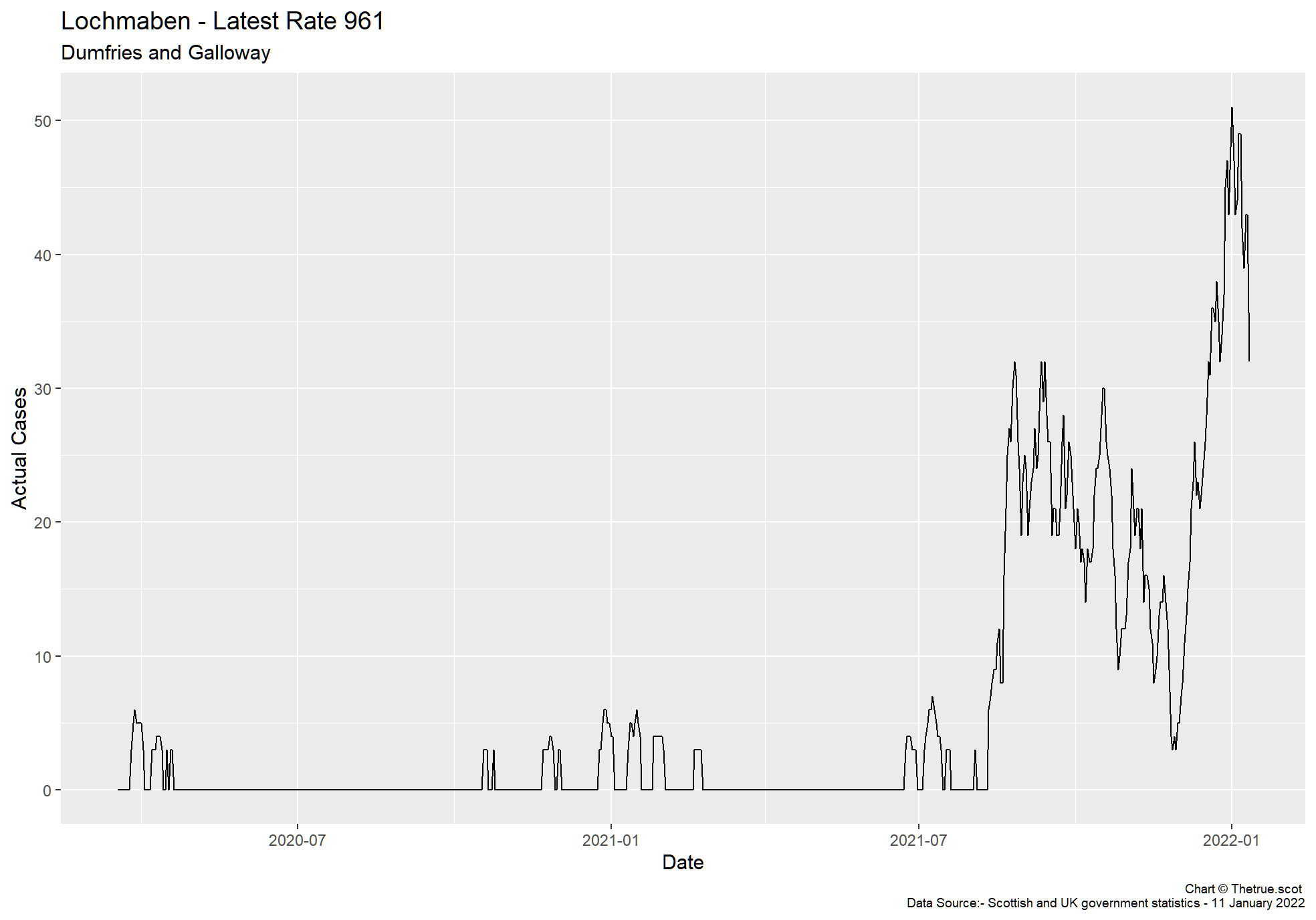
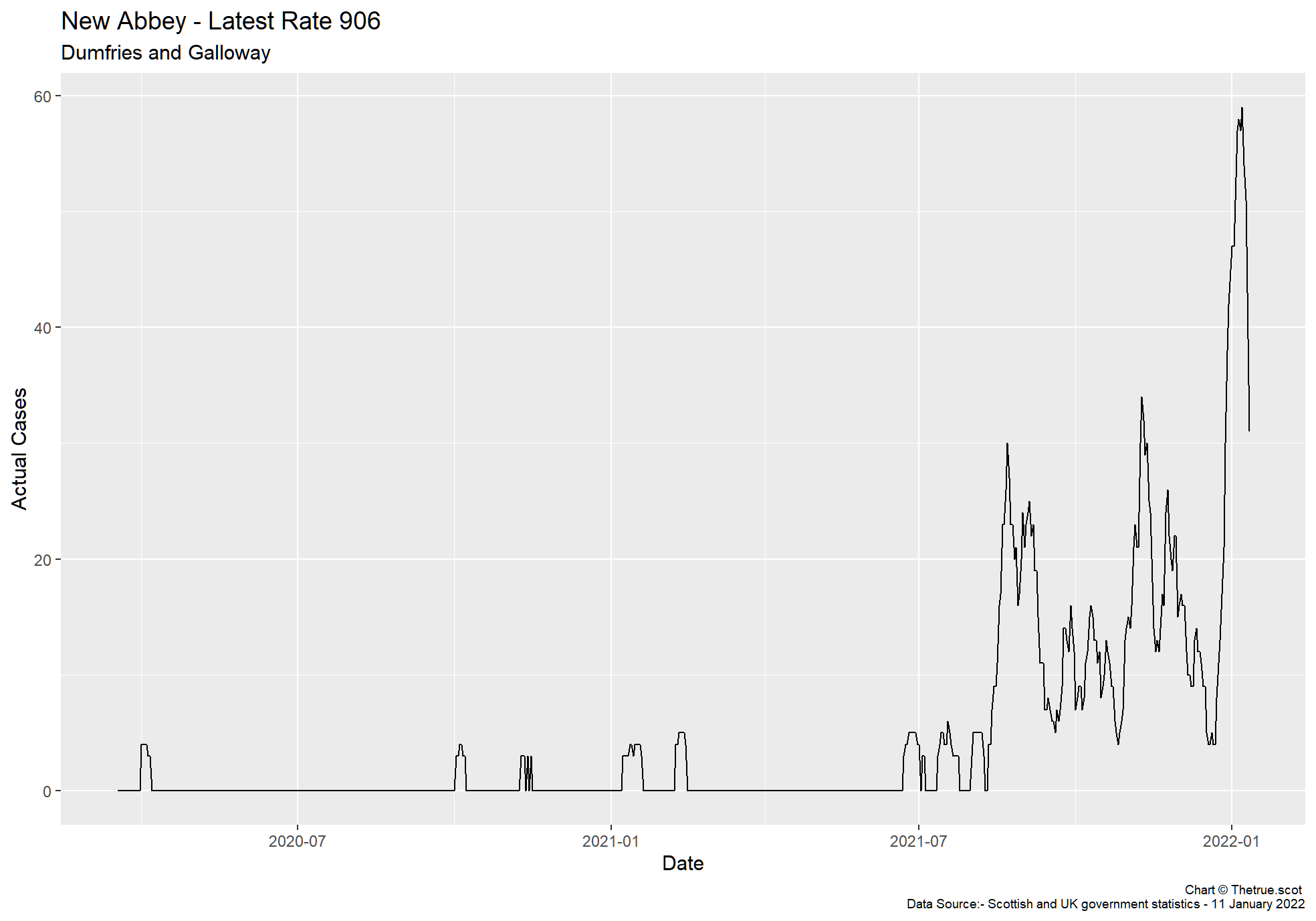
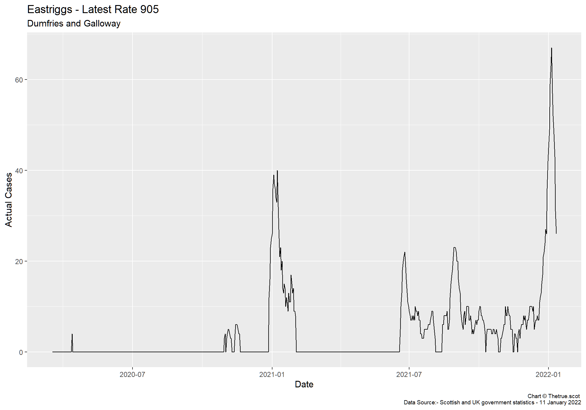
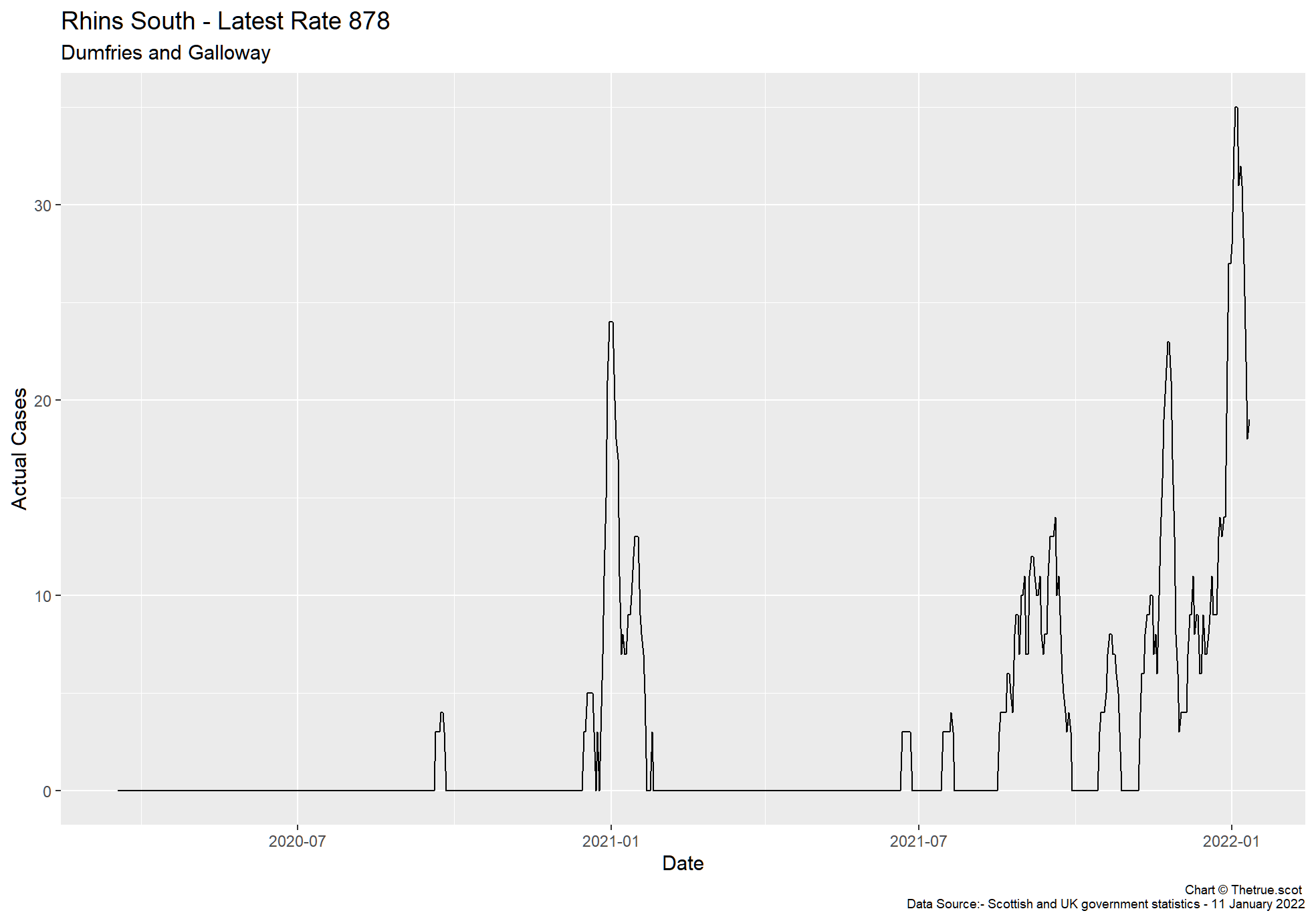
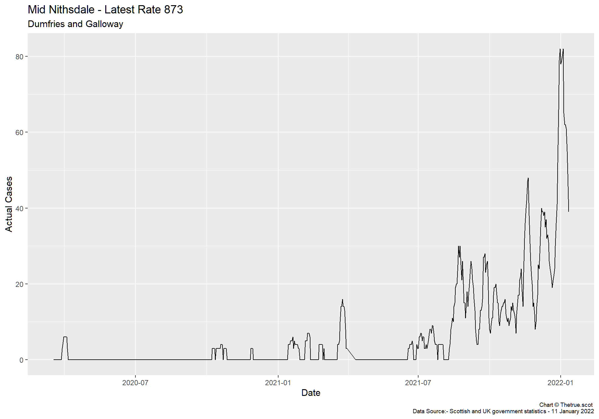
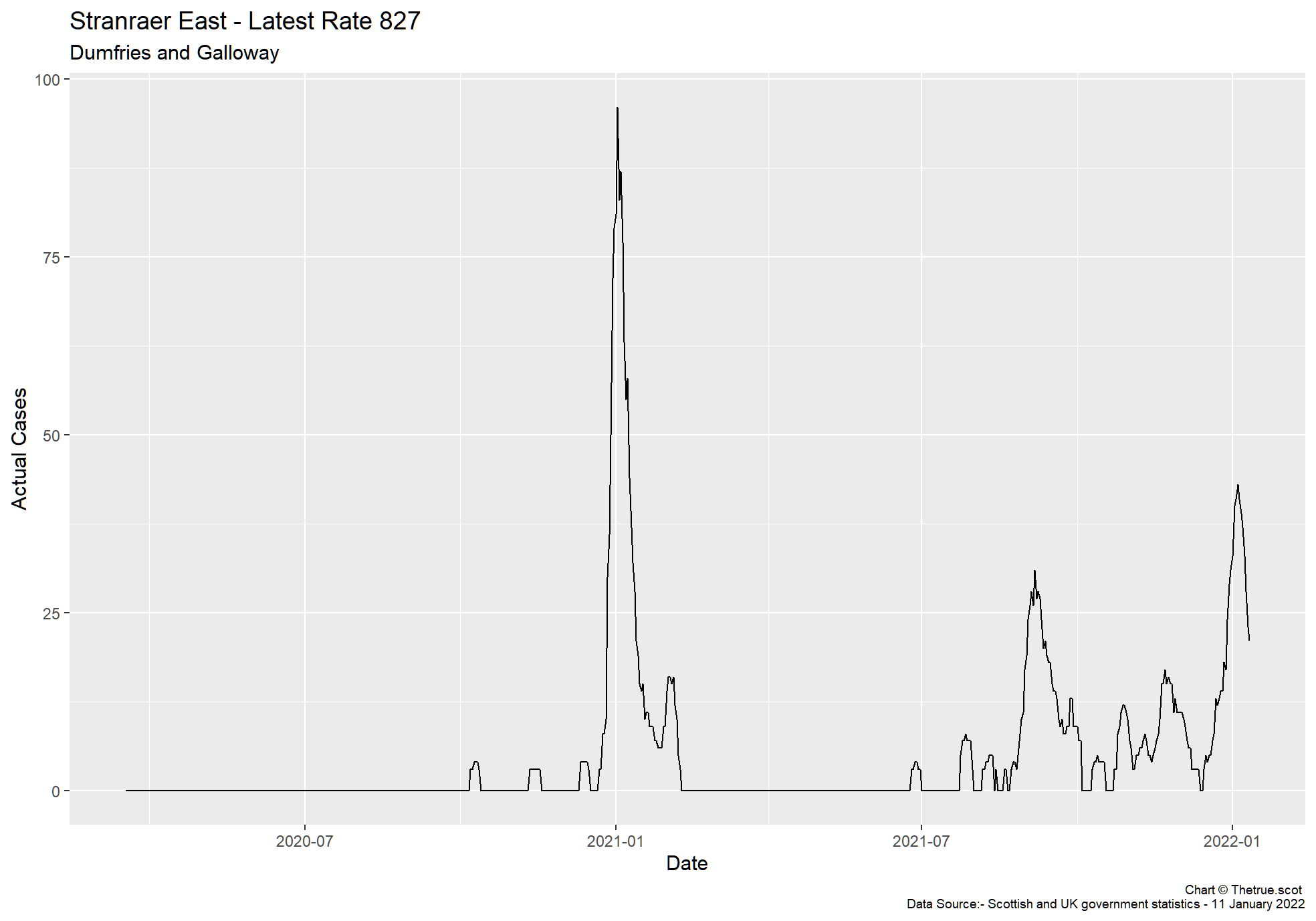
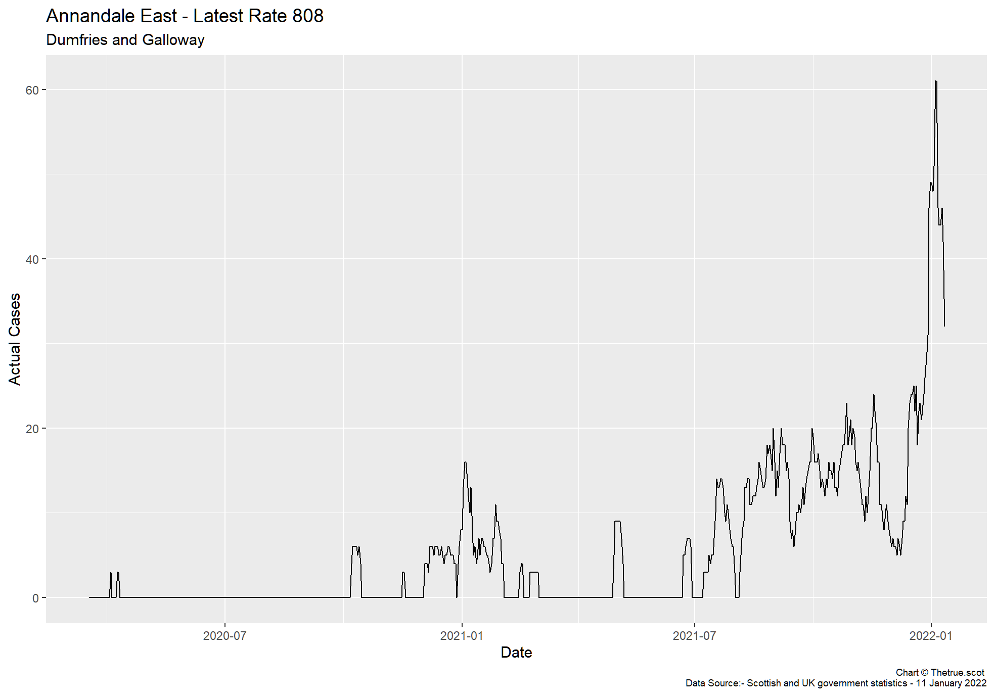
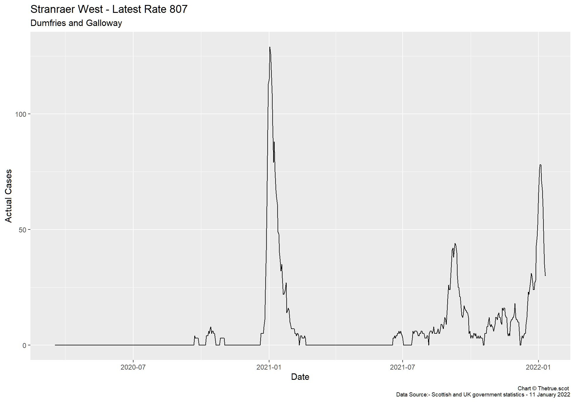
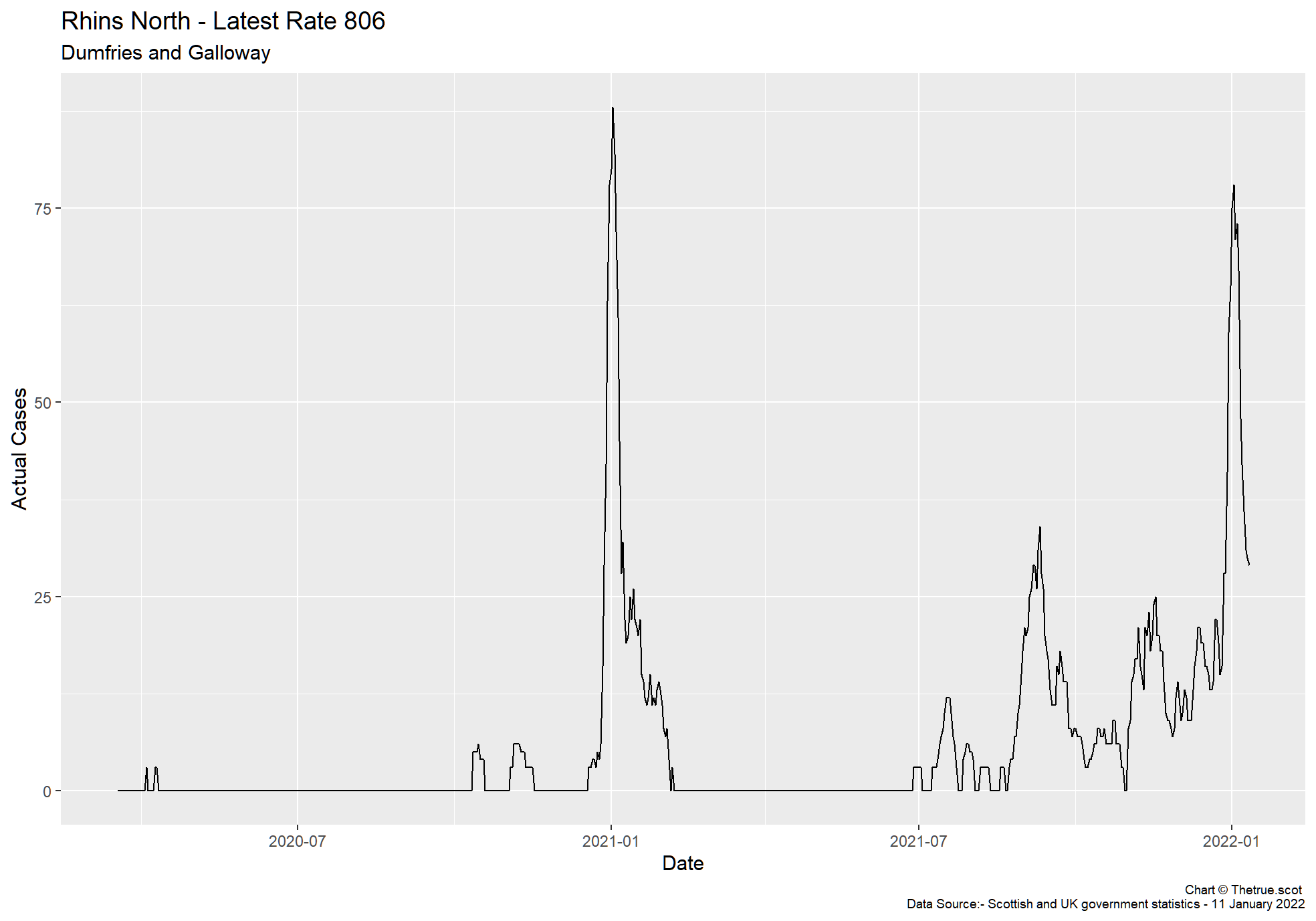
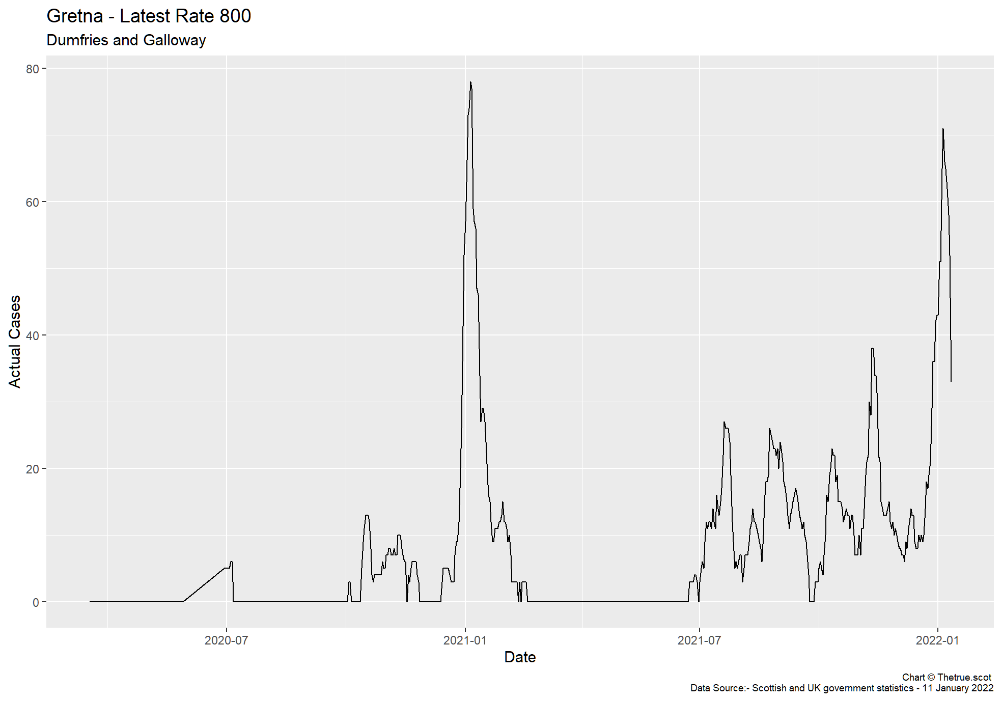
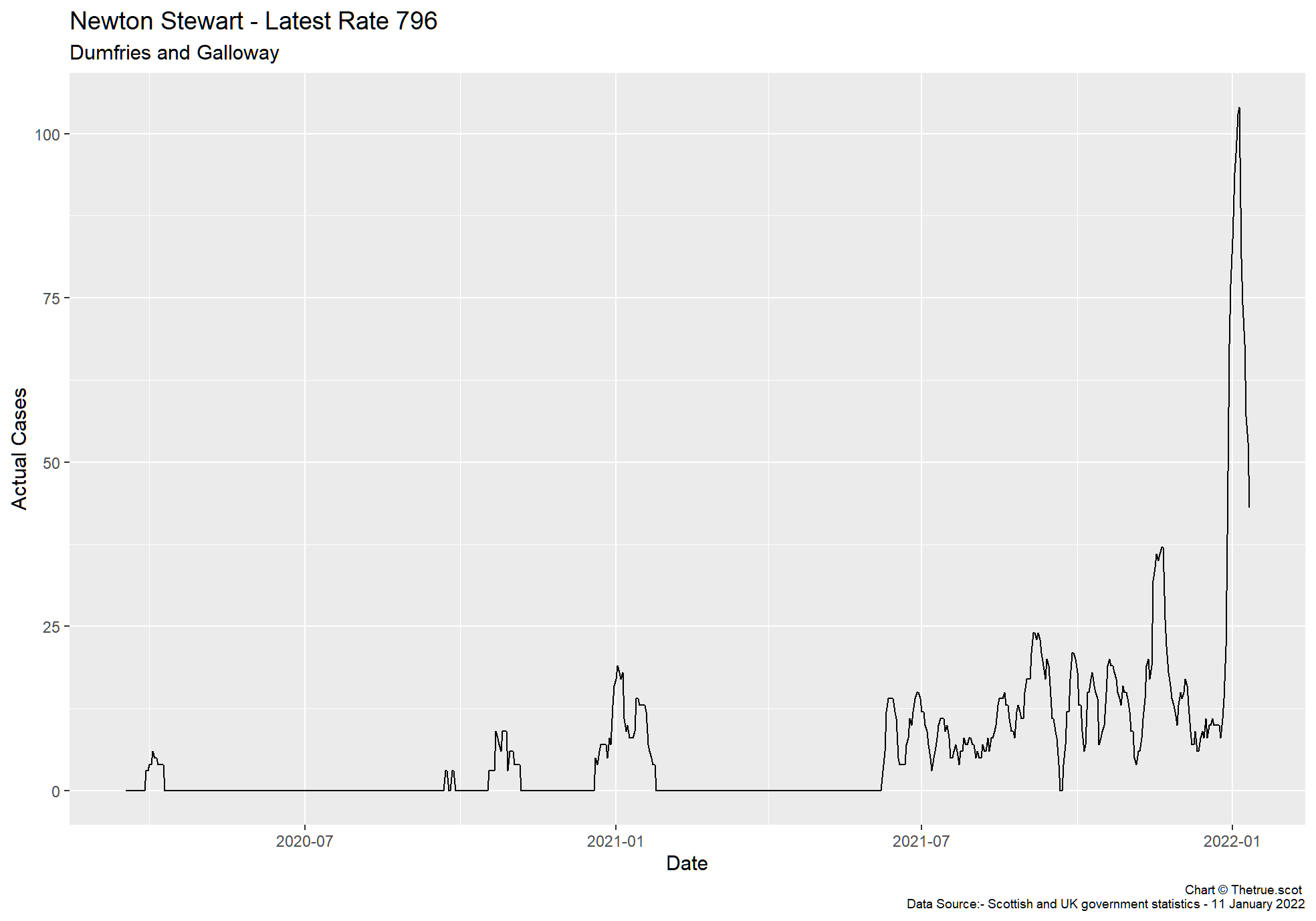
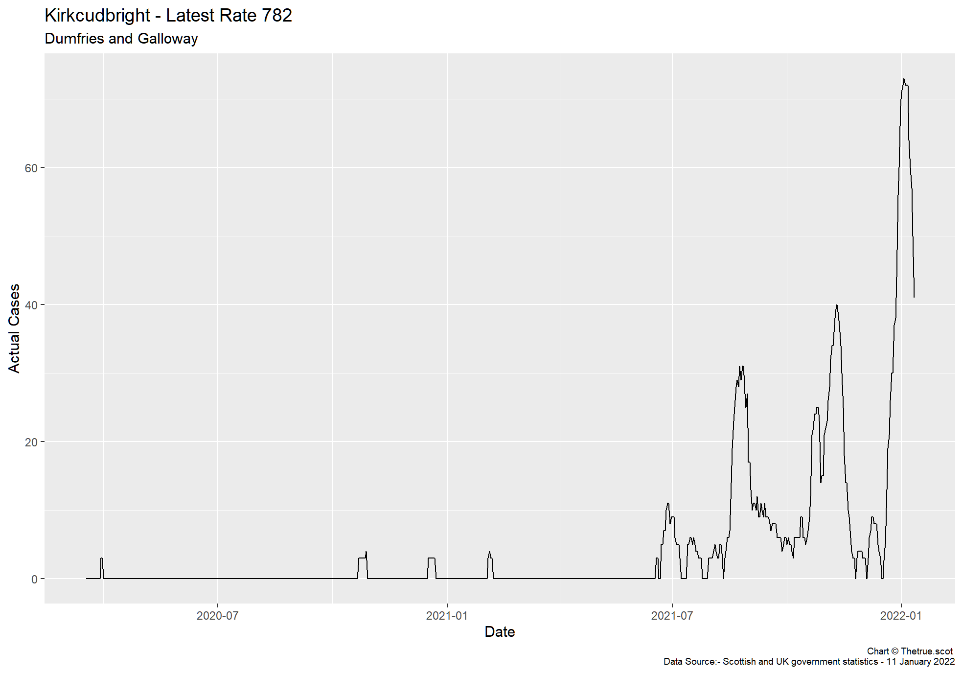
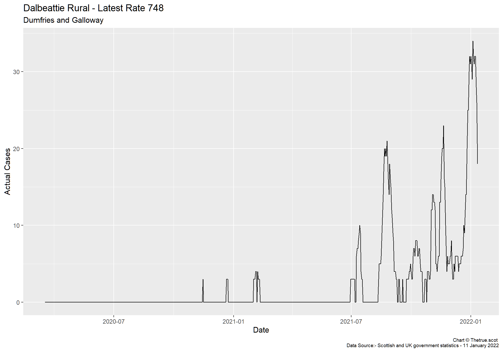
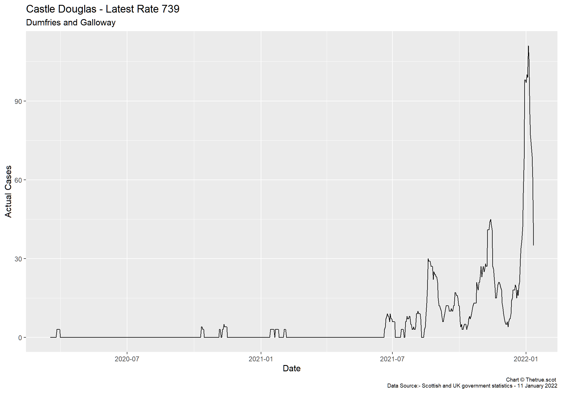
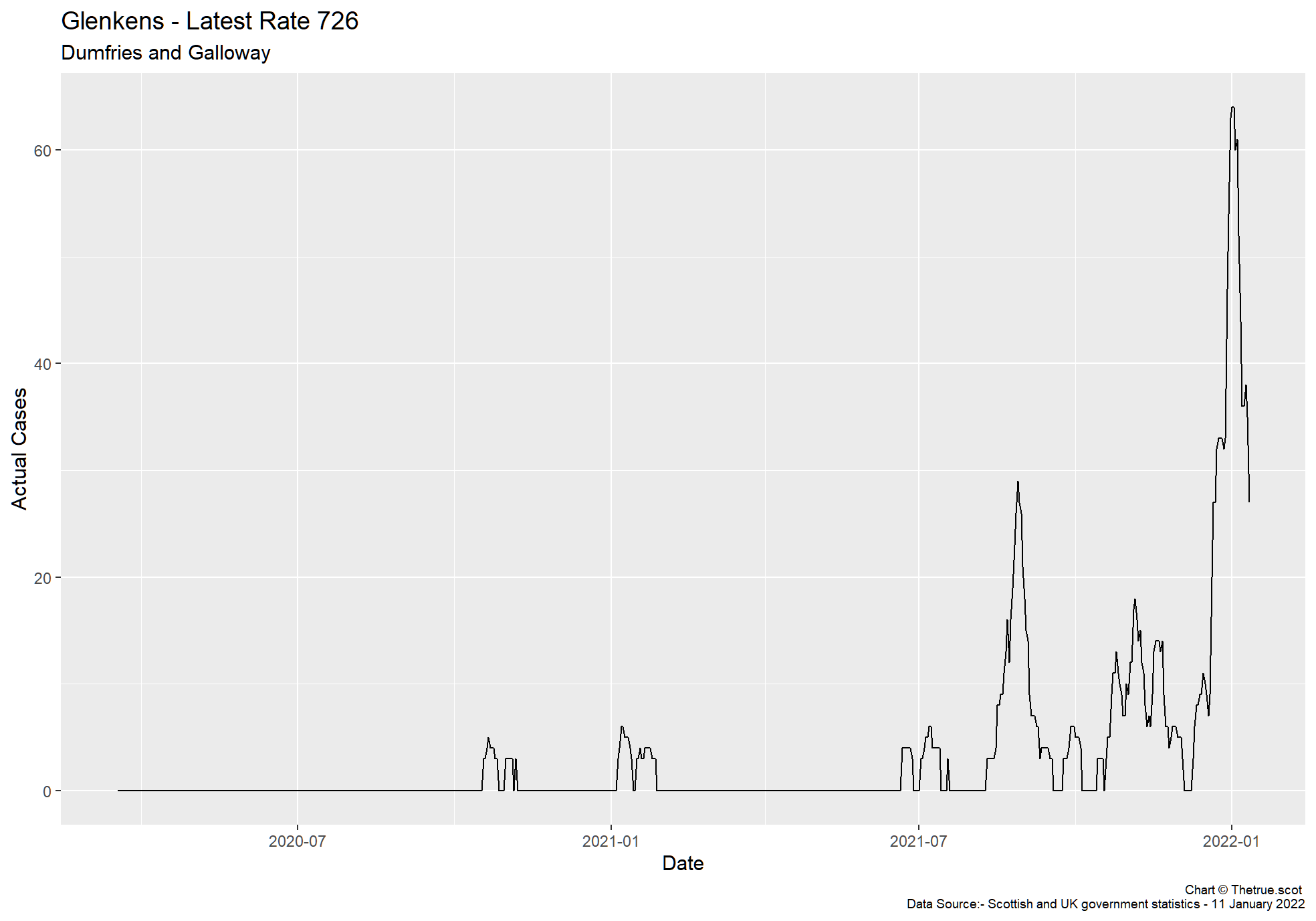
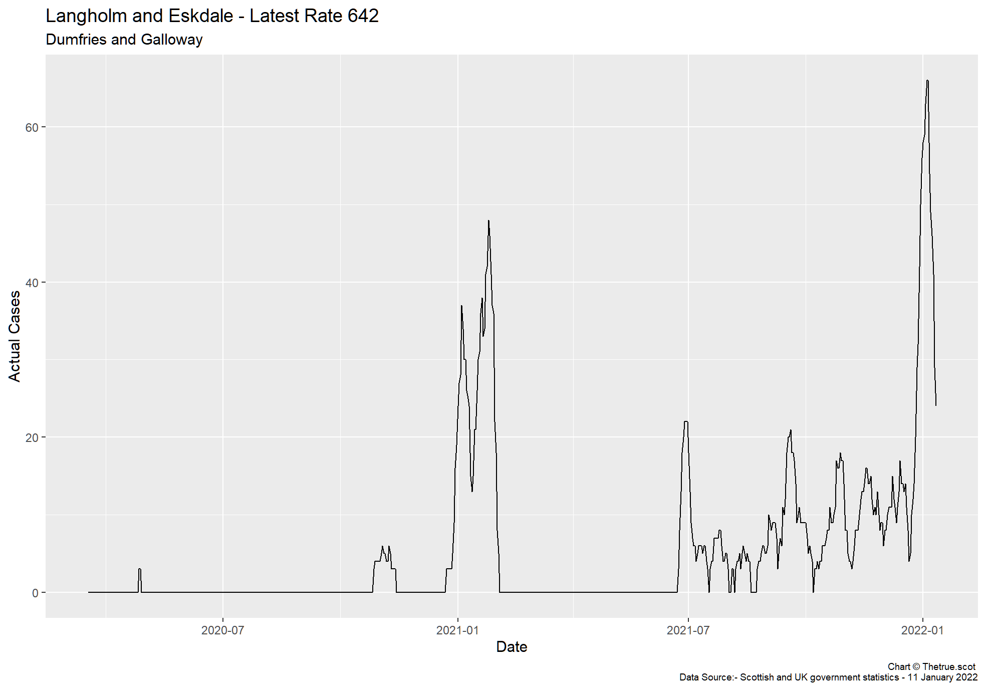
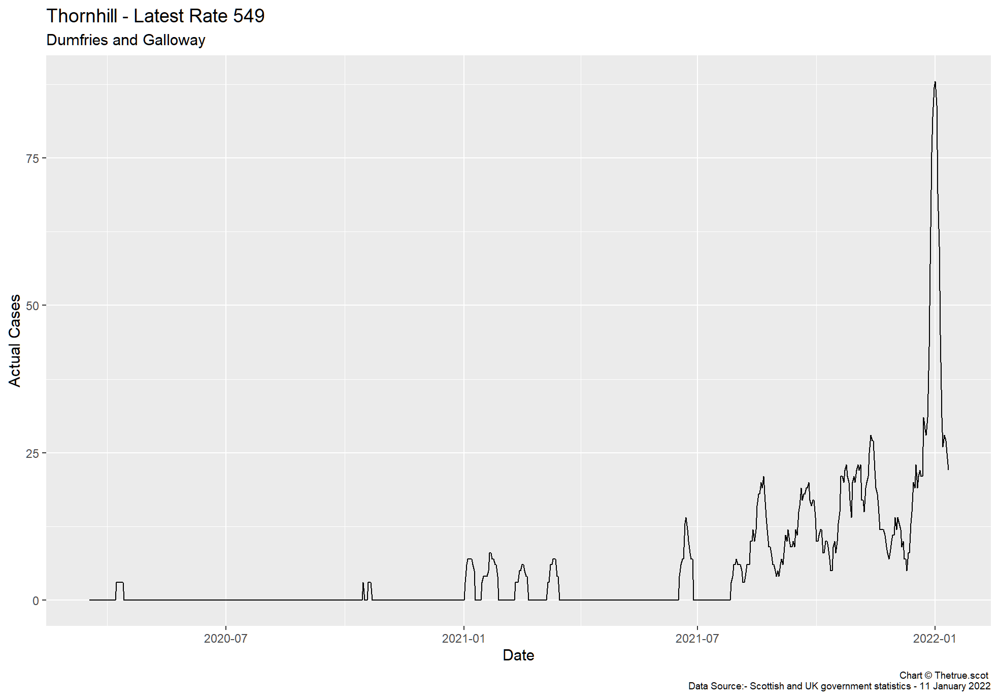
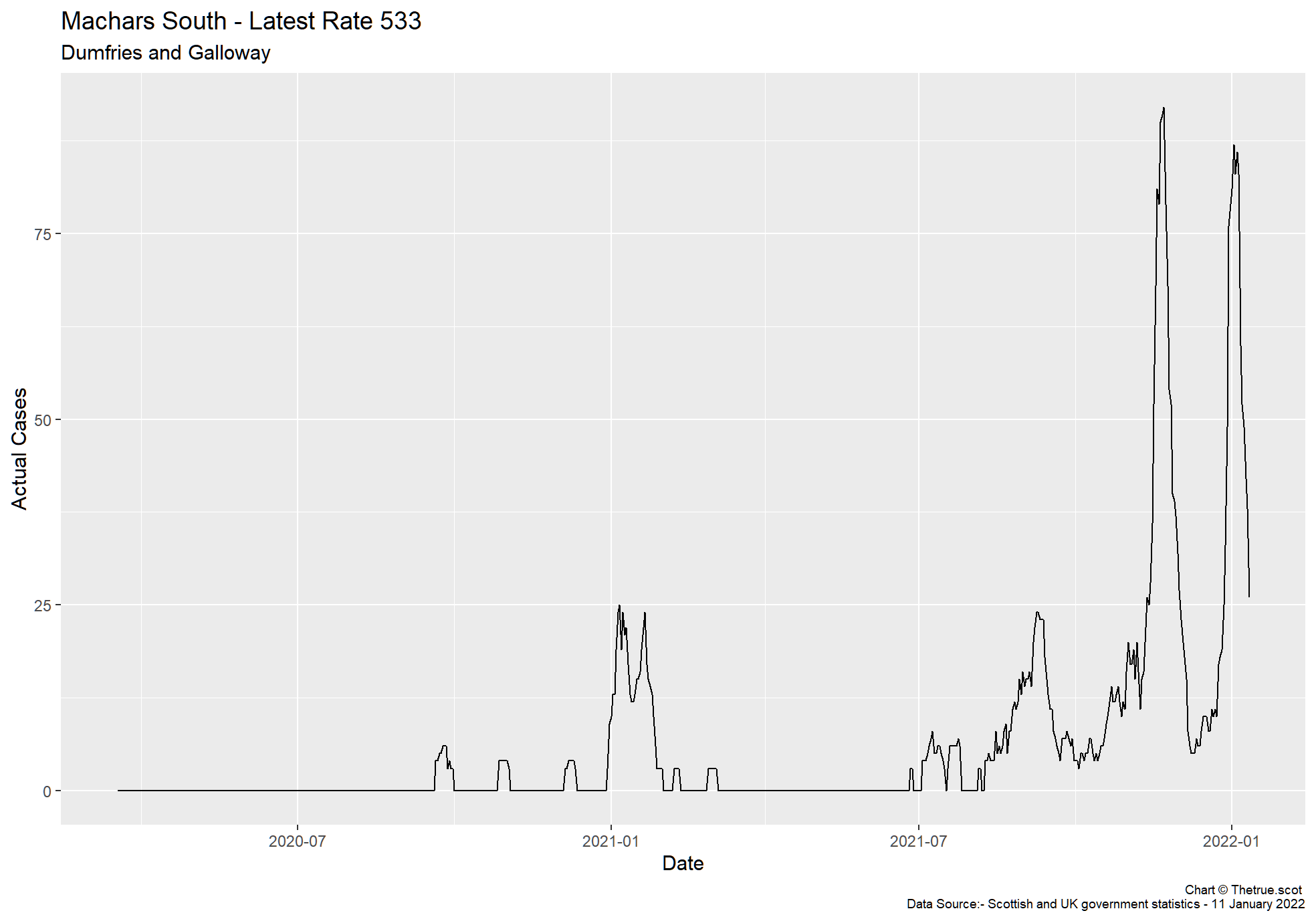
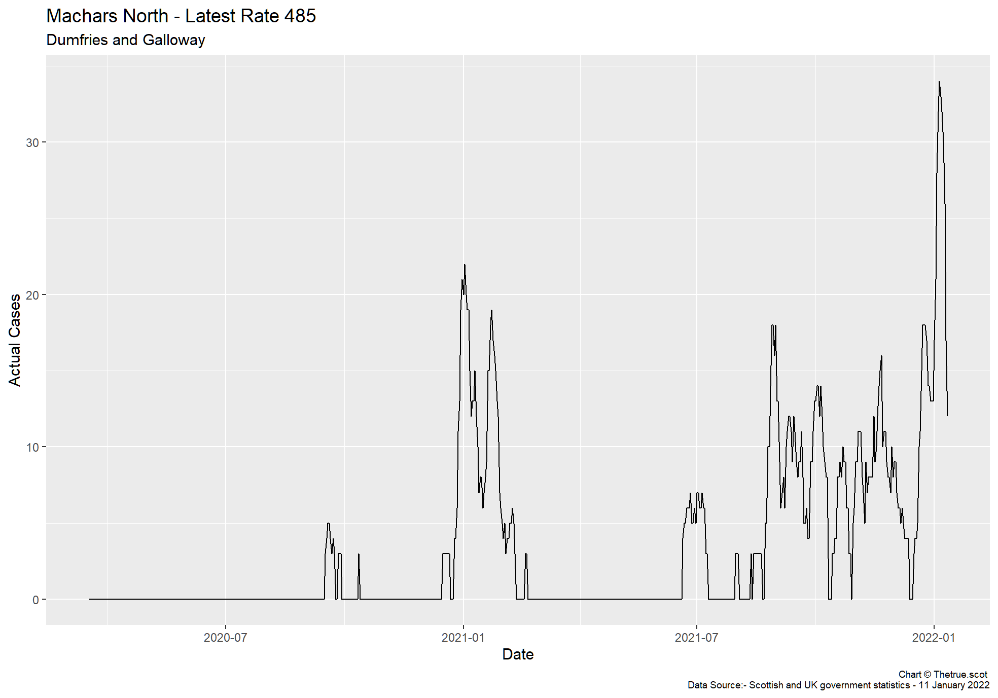
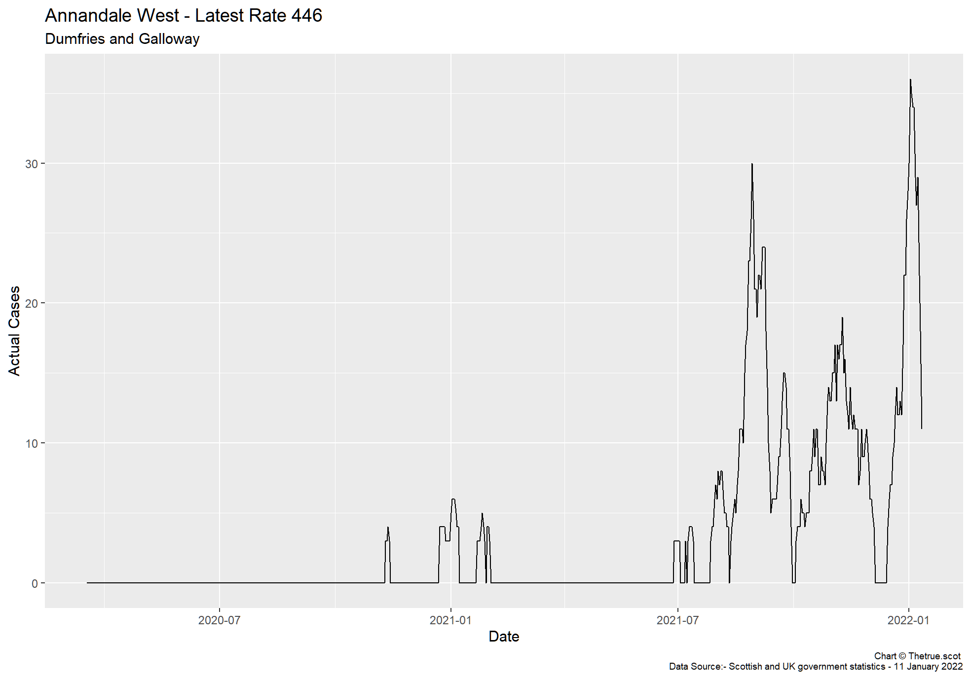
The first chart shows the rate and the number of cases for Dumfries and Galloway. That is followed by a chart for each neighbourhood in the area showing their numbers and history.
These charts are shown in order of highest to lowest case numbers.
This link will take you to the same charts sorted alphabetically lower down the page.
Alphabetic